用轮廓图描绘L、w和b的关系

在上一节,我们已经基本完成了机器学习的建模过程。接下来要介绍的一个辅助性工作叫做轮廓图。损失曲线描绘的是损失和迭代次数之间的关系,而轮廓图则描绘的是L、w和b这三者之间的关系。
下面是补充代码:

1
2
3
4
5
6
7
8
9
10
11
12
13
14
15
16
17
18
19
20
21
22
23
24
25
26
27
28
29
30
31
32
33
34
35
36
37
38
39
40
41
42
43
44
45
46
47
48
49
50
51
52
53
54
55
56
57
58
59
60
61
62
63
64
65
66
67
68
69
70
71
72
73
74
75
76
77
78
79
80
81
82
# 上面是上一节的代码
# 使用contour plot
import matplotlib.animation as animation
theta0_vals = np.linspace(-2, 3, 100)
theta1_vals = np.linspace(-3, 3, 100)
J_vals = np.zeros((theta0_vals.size, theta1_vals.size))

for t1, element in enumerate(theta0_vals):
for t2, element2 in enumerate(theta1_vals):
thetaT = np.zeros(shape=(2,1))
weight = element
bias = element2
J_vals[t1, t2] = loss_function(X_train, y_train, weight, bias)

J_vals = J_vals.T
A, B = np.meshgrid(theta0_vals, theta1_vals)
C = J_vals

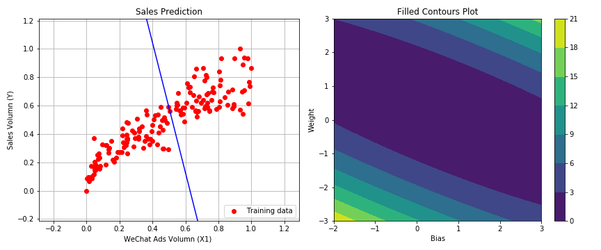
fig = plt.figure(figsize=(12, 5))
plt.subplot(121)
plt.plot(X_train, y_train, 'ro', label='Training data')
plt.title('Sales Prediction')
plt.axis([X_train.min()-X_train.std(), X_train.max()+X_train.std(),
y_train.min()-y_train.std(), y_train.max()+y_train.std()])
plt.grid(axis='both')
plt.xlabel('Wechat Ads Volumn(X1)')
plt.ylabel('Sales Volumn(Y)')
plt.legend(loc='lower right')

line, = plt.plot([], [], 'b-', label='Current Hypothesis')
annotation = plt.text(-2, 3, '', fontsize=20, color='green')
annotation.set_animated(True)

plt.subplot(122)
cp = plt.contour(A, B, C)
plt.colorbar(cp)
plt.title('Filled Contours Plot')
plt.xlabel('Bias')
plt.ylabel('Weight')
track, = plt.plot([],[],'r-')
point, = plt.plot([],[],'ro')

plt.tight_layout()
plt.close()

def init():
line.set_data([],[])
track.set_data([],[])
point.set_data([],[])
annotation.set_text('')
return line, track, point, annotation

def animate(i):
fit1_X = np.linspace(X_train.min()-X_train.std(),
X_train.max()+X_train.std(), 1000)
fit2_y = bias_history[i]+weight_history[i] * fit1_X

fit2_X = bias_history.T[:i]
fit2_y = weight_history.T[:i]

track.set_data(fit2_X, fit2_y)
line.set_data(fit1_X, fit1_y)
point.set_data(bias_history.T[i], weight_history.T[i])

annotation.set_text('Cost = %.4f' %(loss_history[i]))
return line, track, point, annotation

anim = animation.FuncAnimation(fig, animate, init_func=init,
frames=50, interval=0, blit=True)

anim.save('animation.gif', writer='imagemagick', fps = 500)

# 显示Contour Plot动画
import io
import base64
from IPython.display import HTML

filename = 'animation.gif'

video = io.open(filename, 'r+b').read()
encoded = base64.b64encode(video)
HTML(data='''<img src="data:image/gif;base64,{0}" type="gif" />'''.format(encoded.decode('ascii')))
  • 其中anim.save(‘animation.gif’, writer=‘imagemagick’, fps = 500)在colab会报错,需要安装imagemagick这个依赖项,但是colab好像需要购买colab pro才能安装别的依赖……总之我尝试之后不太行。

这是源代码中展示的最终效果图:

实现多元线性回归模型

多元,也就是说特征是多维的。我们使用下标代表特征的编号,采用以下多元(多变量)的线性方程式来构造假设函数。

y=h(x)=b+w1x1+w2x2+w3x3y'=h(x)=b+w_1x_1+w_2x_2+w_3x_3


在机器学习的程序设计中,这个公式可以被向量化地实现。

y=h(x)=wTx+by'=h(x)=w^T \cdot x+b

还可以进一步把公式简化,也就是把b看作权重w0w_0,则需要引入x0x_0,公式变成:

y=h(x)=w0x0+w1x1+w3x3+w4x4y'=h(x)=w_0x_0+w_1x_1+w_3x_3+w_4x_4

且:

w0x0=b×1=bw_0x_0=b \times 1=b

简写为:

h(x)=wTxh(x)=w^T \cdot x

完整代码如下:

1
2
3
4
5
6
7
8
9
10
11
12
13
14
15
16
17
18
19
import numpy as np
import matplotlib.pyplot as plt
import pandas as pd
# 读入数据
# df表示dataframe,一种数据结构
df_ads = pd.read_csv('/content/drive/MyDrive/Colab Notebooks/advertising.csv')
df_ads.head() # .head()方法就是读取数据集前5行,便于预览

import matplotlib.pyplot as plt
import seaborn as sns # 为统计学数据可视化工具库
# 对所有的标签和特征两两显示相关性的热力图
sns.heatmap(df_ads.corr(), cmap='YlGnBu', annot=True)
plt.show()

sns.pairplot(df_ads,
x_vars=['wechat', 'weibo', 'others'],
y_vars='sales',
height=4, aspect=1, kind='scatter')
plt.show()
1
2
3
4
5
6
7
8
9
10
11
12
13
14
15
16
X = np.array(df_ads) # 构建特征集
X = np.delete(X, [3], axis=1)
y = np.array(df_ads.sales) # 构建标签集
print("张量X的阶:", X.ndim)
print("X的形状:", X.shape)
print("X的内容:\n", X)

# y = y.reshape(len(y), 1)
y = y.reshape(-1, 1) # 等同于上个语句
print ("张量y的形状:", y.shape)

# 张量y的形状: (200, 1)

# 将数据集进行80%(训练集)和20%(测试集)的分割
from sklearn.model_selection import train_test_split
X_train, X_test, y_train, y_test = train_test_split(X, y, test_size=0.2, random_state=0)
1
2
3
4
5
6
7
8
9
10
11
12
13
14
15
16
17
def scalar(train, test): # 定义归一化函数,进行数据压缩
min = train.min(axis=0)
max = train.max(axis=0)
gap = max - min # 最大值和最小值的差
train -= min # 所有数值减去最小值
train /= gap # 所有数据除以最大值和最小值的差
test -= min # 把训练集最小值应用于测试集
test /= gap # 把训练集最大值和最小值的差应用于测试集
return train, test

def min_max_gap(train):
min=train.min(axis=0)
max=train.max(axis=0)
gap = max - min
return min, max, gap

y_min, y_max, y_gap = min_max_gap(y_train)
1
2
3
4
5
6
7
8
9
10
11
12
13
14
15
16
17
18
19
20
21
X_train_original = X_train.copy() # 保留一份训练集数据副本,用于对要预测数据归一化

X_train, X_test = scalar(X_train, X_test)
y_train, y_test = scalar(y_train, y_test)


f, (ax1, ax2, ax3) = plt.subplots(1,3,sharey=True,figsize=(20, 4))

ax1.plot(X_train[:,0:1], y_train, 'ro', label='WeChat Training data')
ax1.set_title('WeChat')
ax1.legend()

ax2.plot(X_train[:,1:2], y_train, 'bo', label='Weibo Training data')
ax2.set_title('Weibo')
ax2.legend()

ax3.plot(X_train[:,2:3], y_train, 'go', label='Others Training data')
ax3.set_title('Others')
ax3.legend()

plt.show()
  • 这里我们将三个维度的散点图可视化
1
2
3
4
5
6
7
x0_train = np.ones((len(X_train), 1)) # 构造X_train长度的全1数组配合对偏置的点积
X_train = np.append(x0_train, X_train, axis=1) # 把X增加一系列的1
x0_test = np.ones((len(X_test), 1)) # 构造X_test长度的全1数组配合对偏置的点积
X_test = np.append(x0_test, X_test, axis=1) # 把X增加一系列的1
print("张量X的形状", X_train.shape)

# 张量X的形状 (160, 4)
1
2
3
4
5
6
7
8
9
10
11
12
13
14
15
16
17
18
19
20
# 损失函数
def loss_function(X, y, W): # 手动定义一个均方误差函数
y_hat = X.dot(W.T)
loss = y_hat.reshape((len(y_hat),1)) - y # 每一个y'和训练集中真实的y之间的差异
cost = np.sum(loss ** 2) / (2*len(X)) # 这是均方误差函数的代码实现
return cost

# 梯度下降
def gradient_descent(X, y, W, lr, iterations):
l_history = np.zeros(iterations) # 初始化记录梯度下降过程损失的数组
W_history = np.zeros((iterations, len(W))) # 初始化记录梯度下降过程权重的数组
for iter in range(iterations): # 进行梯度下降的迭代,就是下多少级台阶
y_hat = X.dot(W.T)
loss = y_hat.reshape((len(y_hat), 1)) - y
derivative_W = X.T.dot(loss)/len(X)
derivative_W = derivative_W.reshape(len(W))
W = W - lr * derivative_W
l_history[iter] = loss_function(X, y, W)
W_history[iter] = W
return l_history, W_history # 返回梯度下降过程中的数据
1
2
3
4
5
6
7
# 确定参数的初始值
iteration = 300 # 迭代300次
alpha = 0.25 # 初始学习速率为1
weight = np.array([0.5, 1, 1, 1]) # 权重
print("当前损失:", loss_function(X_train, y_train, weight))

# 当前损失: 0.8039183733604857
1
2
3
4
5
6
7
8
# 定义线性回归模型
def linear_regression(X, y, weight, alpha, iteration):
loss_history, weight_history = gradient_descent(X, y, weight, alpha, iteration)
print("训练最终损失:", loss_history[-1]) # 打印最终损失
y_pred = X.dot(weight_history[-1])
training_acc = 100 - np.mean(np.abs(y_pred-y)*100) # 计算准确率
print("线性回归训练准确率:{:.2f}".format(training_acc))
return loss_history, weight_history
1
2
3
4
5
6
7
8
9
10
11
12
13
14
15
16
17
18
19
20
21
22
# 调用刚才定义的线性回归模型
loss_history, weight_history = linear_regression(X_train, y_train, weight, alpha, iteration) #训练机器

# 画出各个权重随梯度下降的变化图
plt.figure(figsize=(12, 4))
plt.subplot(121)
plt.plot(loss_history, 'g--', label='Loss Curve')
plt.xlabel('Iteration')
plt.ylabel('Loss')
plt.legend()

plt.subplot(122)
plt.plot(weight_history, 'b--', label='Weight Curve')
plt.xlabel('Iteration')
plt.ylabel('Weight')
plt.show()

print(weight_history[-1])

# 训练最终损失: 0.0020534948072892627
# 线性回归训练准确率:75.99
# [0.05592132 0.64217276 0.22460039 0.0889083 ]

曲线变化如图:

1
2
3
4
5
6
7
8
X_plan = [250, 50, 50]
X_train, X_plan = scalar(X_train_original, X_plan)
X_plan = np.append([1], X_plan)
y_plan = np.dot(weight_history[-1], X_plan)
y_value = y_plan*23.8+3.2
print("预计商品销售额:", y_value, "千元")

# 预计商品销售额: 7.944991957387483 千元

课后练习

一 请用sklearn库的线性回归函数完成同样的任务。

二 在sklearn库中,除了前面介绍过的线性回归(Linear Regression)算法以外,还有岭回归(Ridge Regression)和套索回归(Lasso Regression)这两种变体。请尝试使用这两种线性回归算法,并应用于本课的数据集

导入第3课的练习数据集:Keras自带的波士顿房价数据集,并使用本课介绍的方法完成线性回归,实现对标签的预测。